Procreate Doodle 2

Procreate Doodle 2

Had fun with the Procreate app again! This time, I decided to add a title and ending card to the video I created in iMovie. Still not entirely confident with video editing and uploading to YouTube, but it is fun to post these iPad speed paintings of mine only using my finger and a generic stylus. Since I recently bought a book called Lifestyle Illustrations of the 1950s, it inspired me to use one of the illustrations by Frank Bellamy as a reference.

“This world is but a canvas to our imagination.” -Henry David Thoreau

Speed Doodling in Procreate

Seeing other artists create speed paintings has peeked my interest enough that I have been wanting to figure out how to create my own. There are moments where I know I have a lot to do, but I just want to take a moment to create something for myself. This time I wanted to figure out how to do a quick video of a digital illustration that I could do on my iPad. I already had the Procreate app on there and what is wonderful is it already records every action as a frame of video.

To export the video, you can go to your Actions menu while on the canvas, tap Share, and tap Export Video. Mine took a little while at first so be patient! I chose to email it to myself since I wanted to pop it into iMovie to add music. The music was already an option to use in iMovie, and I thought about adding info about me to the video but I was impatient.

One thing I noticed right away after creating the movie, the colors appeared a bit different on my computer screen from what I chose on the iPad. Be aware this could happen! Of course, since I did the doodle rather fast, every time I look at it I feel I could make it a little brighter and give it higher contrast. Artist’s work is never done right? 🙂

Click here to see the speed painting video on YouTube of the drawing you see below!

Speed Doodling in Procreate

WIP Sideshow 11 Doodle Series

WIP 8x10 DoodleWIP 8″x 10″ Doodle for Dayton Sideshow 11

Even though I have signed up as one of the art coordinators for Dayton Sideshow 11, I decided I wanted to attempt to be one of the showing artists again. With me not only working at my regular Monday through Friday, 8-4:30 pm design job, but to have teaching, helping with a nonprofit, and commissions on the side along with it has made me feel a little crazy. Then to top it all off, my mother was diagnosed with breast cancer. I do believe I have signed up for a little more than I can handle, but I am hanging in there and trying to stay positive! Sometimes taking it a day at a time is the best thing.

The piece I created for Twitter Art Exhibit: NYC (blog post will come later) made me realize I should do something similar for Sideshow 11. Originally, I wanted to play around with Ampersand’s Claybord material. The test board made me realize that the way I use acrylic does not work really well on the surface. SIDENOTE: Whenever you get a chance artists/crafters, TEST your mediums that you are not familiar with because you may be surprised in the results. In fact, colored pencil worked really well on the surface, but I knew it would take FOREVER.

For the sake of time and knowing that I would need at least three 8″x 10″ pieces finished by the beginning of May, I have switched back to watercolor paper, Prismacolor lining pens, and acrylic paint. The other day, I was able to pencil out one 8″x 10″ piece and the preview is above. Next step? INKING!

Sunday Doodles

Sunday Doodles
Pencil Doodle on 9″x 12″ Bristol

It can be so easy to get caught up in day to day activities, but there are quiet times that I really crave when I become so busy. Sunday, I took the time to wind my mind down and pencil out some doodles.Thought I might be able to use this for a future t-shirt design or whatnot. In the meantime, it is fun to decompress for a little while. Even when you feel you have no time, this kind of work insists that you make room for it.

Explore Lettering

“Typographical design should perform optically what the speaker
creates through voice and gesture of his thoughts.”
-El Lizzitsky

Have you ever thought about how often we are exposed to letters and words every day? Type can be with illustrations, photographs, or even become art on its own. A certain font chosen for the logo of a company can become it’s very identity. Letters spelling a child’s name on their precious stuffed toy makes it all the more special. A typographer (a designer who specializes in creating and arranging type) has the magical powers to STOP you in your tracks with LARGE, BOLD, and CAPITALIZED letters on billboards hanging on a brick building. Or they want you to float on the cloud of imagination while you read a book without the interruption of loud type.

Anonymous Silhouette (WIP?)

Example of hand lettering working with an illustration.

Many of the fonts we are exposed to may be seen in a digital format or have been printed from a computer, but almost all typefaces have been hand drawn one time or another in the beginning. Currently, hand lettering posters, t-shirts, greeting cards, etc. has become very popular. If you are a lover of words and art, take some time and cover a sheet of paper in words or letters that make you smile. Try to make each word or letter look different from your last and you may want to change to different colored pens or pencils. You don’t necessarily have to be able to read it in the end, but we challenge you to completely cover the sheet in letter forms.

“Typography needs to be audible. Typography needs
to be felt. Typography needs to be experienced.”
-Helmut Schmid

Front of Lettering Mug

Front of Lettering/Type Coffee Mug

To further embrace the opportunity to create your very own hand lettered coffee mug, please join us at the Decoy Art Studio for a 21 & up pottery painting workshop called “Lettering/Type Coffee Mug” on Tuesday, January 12th from 6:30 pm-8:30 pm. What? You are not a typographer? You do not have to be a designer to experience letter forms. So have no fear! We will have carbon paper to help trace the words onto the mug, and our instructor will take you step-by-step through the process of creating the cup pictured in this blog post. If you so choose to alter the artist’s design, it is completely up to you! It is going to be your very own piece of practical art to take home and enjoy.

Back of Lettering Mug

Back of Lettering/Type Coffee Mug

If you would love to learn how to create this wonderful mug on Tuesday, January 12th, 2016, please sign up for the pottery workshop at Decoy Art Studio in Beavercreek, Ohio!
You have three options to sign up:
1. Call the studio at (937) 431-4838
2. Book the “Lettering Type Coffee Mug” workshop on the www.decoy-art.com website by going to the following URL: https://placefull.com/clay-workshops—workshop-wednesday-series
3. Visit the studio at 1561 Grange Hall Rd., Beavercreek, Ohio.

Hope to see you at the Studio!

Hail, Caesar!

The drawing I had created for my Bestie of her Great Dane, Maggie, sparked some requests for commissions. My hairdresser, Jessi (who is amazing) asked if I would do a portrait of her beloved Boston Terrier, Caesar. She had dozens of adorable pictures of him for me to work from, but ultimately we went with the image below for the 8″ x 10″ piece.

original caesar

Original Photo of Caesar

With as much variation that was going on with his skin and fur, I was a little worried I wouldn’t be able to express which part of the fur was black or not. As soon as I started penciling, I decided to be as detailed as possible so it wouldn’t take me as long to ink. Think of sketching or drawing details as becoming the map to follow to the treasure.

WIP Penciled Caesar

Work in progress of Caesar the Boston Terrier.

Once I finished the penciling, I could tell Caesar was going to be more detailed than the Maggie portrait.

WIP Inked Detail of Caesar

Detail of work in progress. Caesar is a Boston Terrier.

In the past, I would tend to ink drawings with Micron or Prismacolor fine line markers, but the variation I am able to get with a ballpoint pen has really made me exclusively use ballpoint this year. The line work can go from really soft and light to a hard, dark line. The only drawback to a ballpoint is the fact it likes to spit ink onto the paper. I try to work with it when it does happen, but I am always nervous about the possibility of it ruining a piece.

WIP Inked Caesar

Work in progress. The entirely inked piece of Caesar the Boston Terrier.

Since my doodles or patterned backgrounds have been a part of my work this year, I asked Jessi what kind of pattern she wanted behind Caesar. I find it makes it more personal to your customer when they can feel connected with everything in your art. She had mentioned she really loved Victorian style patterns, and I was able to find a pattern to draw behind the dog.

Even though she wanted to keep it black, white, and red in the painting stage, I added a few other colors to bring his eyes to life and to show the difference in his skin and fur. The reds, purples, and blues mixed in the background really brought the piece to another level. It looked great as a strictly black and white piece, but I truly love the way it turned out in the end.

Hail, Caesar!

Final painted ballpoint drawing of Caesar the Boston Terrier.

Size: 8″ x 10″
Paper: Watercolor
Medium: Ballpoint and acrylic

Free Sketching

“You can’t do sketches enough. Sketch everything and keep your curiosity fresh.”
-John Singer Sargent

Experiencing a dry spell of creativity or trying to work out an idea? If you are a writer, you may be familiar with a prewriting technique called free writing. For a set period of time you continuously write without regard to the topic, and it could end up being the words, “I don’t know what to write.” over and over again on the page. Think of it as exercising your brain, and you can also use this technique with sketching. 

A sketchbook becomes a booklet of possibilities that you keep by your side. Don’t be afraid to make random marks, doodles, patterns, or spread color around. Express your ideas using lines or words! Sketching is a great way to become more familiar with mediums you haven’t used before. Or doodle what you see in the world while you are on a lunch break. You don’t even have to “finish” a drawing. Paint a color and leave the page to draw something else. There is no rule that says you can’t go back to the painted page.

“Sketchbooks should be the one place without rules.”
-Marilyn Patrizio

A Page from College Sketchbook

Admittedly, I have never been an artist who regularly sketches, but it does help me work out the ideas rattling around in my head. Knowing I was going to be teaching a pottery painting class at Beavercreek’s Decoy Art Studio on Wednesday, October 28th, I broke out some paper and thought about what a 21-year-old & up group would want to paint for a “Fall To-Go Mug.” 

Fall To-Go Mug Sketches

Without worrying about making perfect drawings, I used my pen, Crayola watercolor set, Sharpies, and drawing pencil to figure out a possible design. Wanting to include at least one of the specialty glazes from the studio, I drew out a few ideas but ultimately was drawn to the complementary color (meaning any two colors that are directly opposite each other on the color wheel) combination of blue and orange. 

The final piece gives a nod to the fall theme without hitting you over the head with it. People will enjoy carrying this mug whether the season has passed or not. If you would love to learn how to create this wonderful mug on Wednesday, October 28th, 2015, please sign up for the Wednesday Workshop at Decoy Art Studio in Beavercreek, Ohio! The price is $30 per person and this includes the instruction, your mug, and use of the glazes.

You have three options to sign up:
1. Call the studio at (937) 431-4838
2. Surf their website at www.decoy-art.com
3. Visit the studio at 1561 Grange Hall Rd., Beavercreek, Ohio

Final Fall To-Go Mug

Hope to see you at the studio!

The Progression of Maggie

Using the same type of process as I was doing for my Musician/Singer Series, I wanted to make a late birthday gift for my Bestie, Michelle, who was moving back from San Francisco. Sneakily, I looked through her Facebook and found a perfect image of her Great Dane, Maggie.

Maggie, The Goofy Great Dane

When creating your own artwork or photography, think about keeping compositions off center or not entirely symmetrical. It helps create intrigue when it isn’t stuck in the center of the paper or photo. There was a lot of personality to the picture above because of her right ear being folded in on itself and it not looking like the other ear. Once drawn out in pencil (often use Faber-Castell or Staedtler brands) on an 8″x10″ piece of watercolor paper, I did have a moment where I wondered if the ear would be too weird, but I ultimately stuck with it.

WIP Great Dane Portrait
WIP Penciled Portrait of Maggie

It took me a while to get going on the inking of the pencil drawing because (to this day) inking makes me nervous. Ha! There is this fear that one stroke is going to ruin the whole piece. Especially, since ballpoint pens do have a tendency to spit ink from time to time. I try to switch to a different pen (I have several of one kind I like) when that happens, and that tends to help the problem. Or I have a little strip of paper that I will roll the ballpoint tip on to clean it up. Once I finished the inking without any catastrophes, I felt it really brought her to life.

WIP Inked Maggie
WIP Inked Portrait of Maggie

After I doodled in the background with a finer ballpoint pen, I felt I might have taken away from the dog by doing so and decided to paint the background thick enough to dim the doodles. At first, I was thinking of painting everything in bright colors but after my dad mentioned it would be a shame to not leave the dog white I was tempted to do as he suggested. Concentrating on only painting her tongue, inner ear, slightly in the eyes, and then the background, I went to town. This town I was painting dominantly pink, and then I realized I had almost obliterated the doodle background. Whoops! I gave it a day to dry before I went back over the doodles with the thin ballpoint, and BAM it looked great!

“Creativity is allowing yourself to make mistakes. Art is knowing which ones to keep.”
-Scott Adams

Final Painted Drawing of Maggie

Musician/Singer Series Pt. 3: T-Boz, Gwen Stefani, and Pink

Three Pencil Sketches
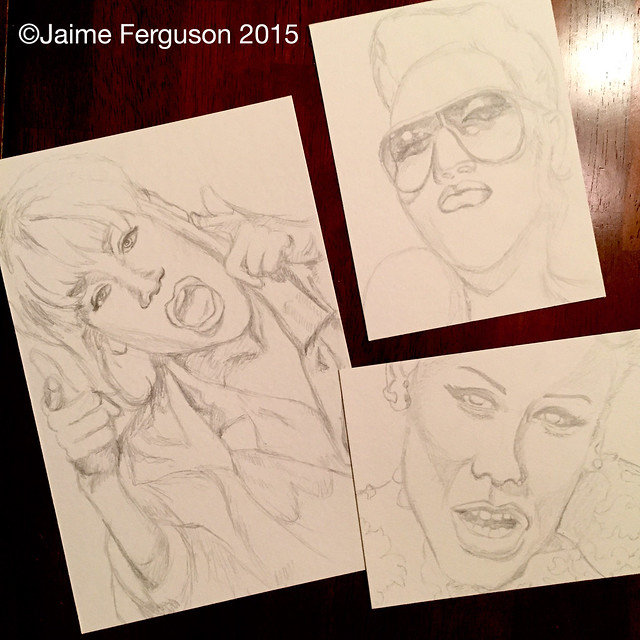
Three pencil sketches of T-boz, Gwen Stefani, and Pink

In one night, I had cranked out these three pencil sketches for my Musician/Singer Series. At this point, I was trying to pick facial expressions that were different from the other pieces. These were the three I also had love/hate relationships with during the making of them.

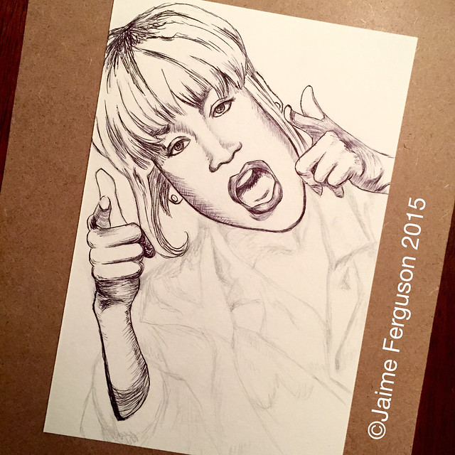
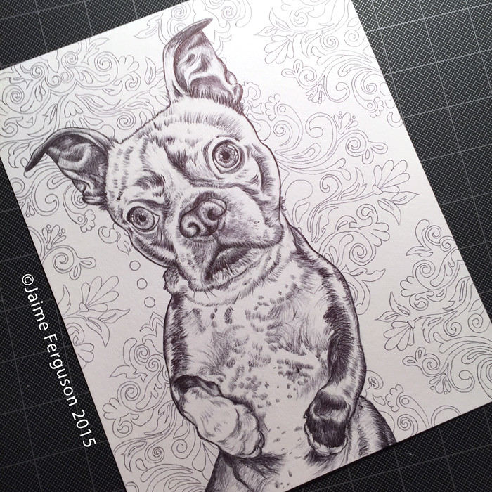
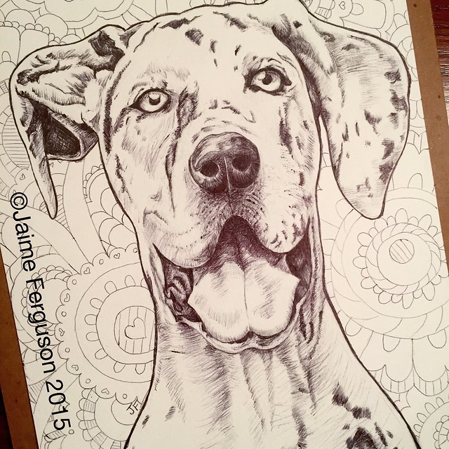
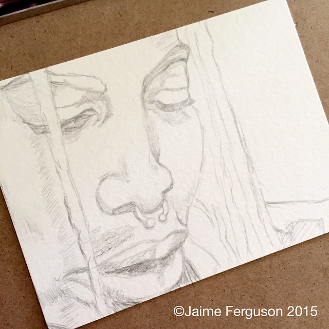
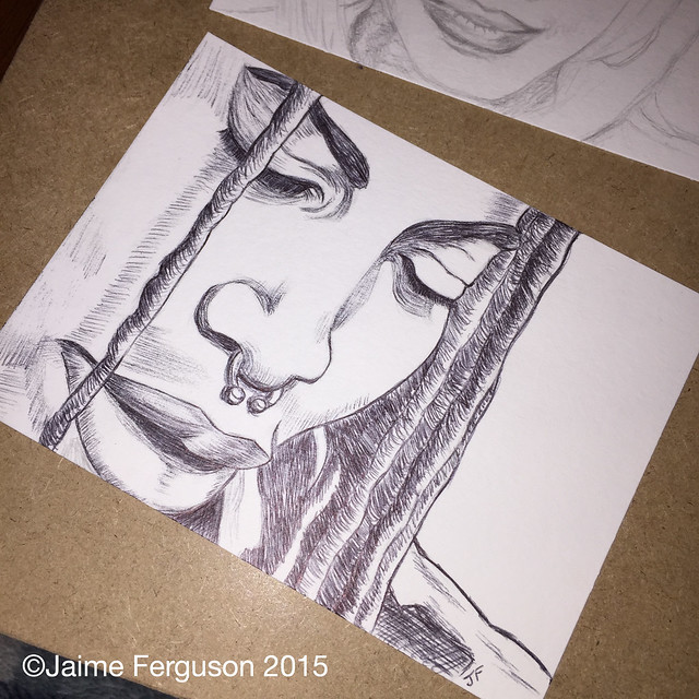
Ballpoint WIP of T-Boz

The composition of T-Boz (Tionne Watkins) from TLC had the most movement out of the entire series. She wasn’t too hard to ink, but I was trying to be as careful as possible with the hands. I have found that it is best to use the shadows to help shape your hands more rather than to draw only an outline of the fingers and palm. Especially when you have fingers pointed and some bent toward the palm, there will be a lot of foreshortening (Dictionary.com says it is “to reduce or distort in order to convey the illusion of three-dimensional space as perceived by the human eye”) happening within the drawing. Hands always feel complicated. Many kids that I have taught in drawing programs will avoid them like the plague by drawing characters with their hands behind their back, etc. Maybe the fact I do focus a lot on the face in my work, is a little sign that I am avoiding the hands as well without consciously making a note of it?

Final Mixed Media of T-boz
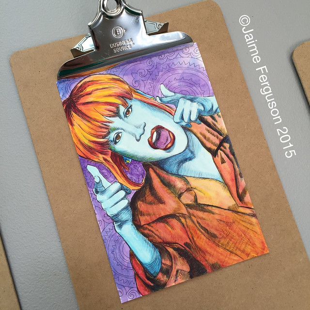
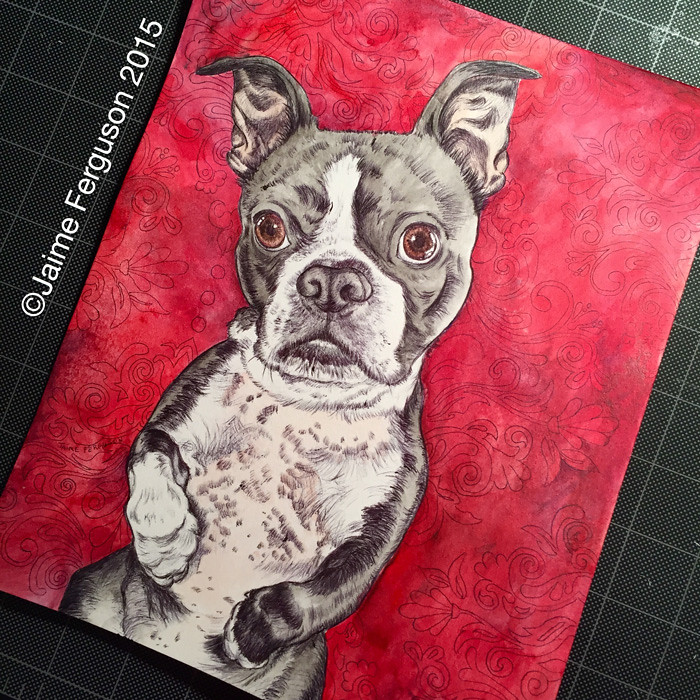
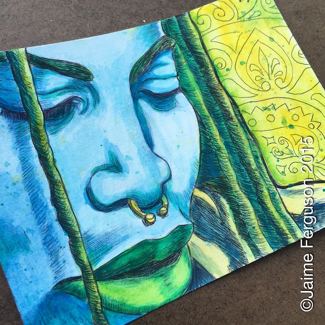
Final Mixed Media of T-Boz

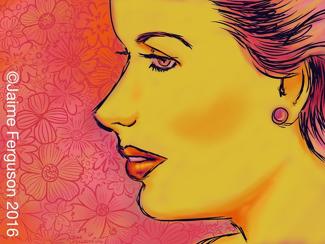
Originally, I was going to paint her nicely creased shirt green and yellow, but as I was laying down the color I thought it looked HORRIBLE! In fact, I almost scrapped the whole thing then and there because I was getting short on time before the art show. Taking a deep breath, I grabbed a paper towel and tried dragging off as much paint as possible, wetting it with a clean brush, and wiping it again until I was able to get as much of the color off the paper. I already made her hair orange and skin blue, and was afraid making her shirt similar to the hair wouldn’t let her stand out. Once I painted the yellow layer, then my orange, and then a darker red, it looked better and you couldn’t even tell I had started making it green. The crosshatching of the ballpoint also made it different enough from the hair. Making the background purple behind her, pushed her orange and blue colors forward and toned down the more detailed pattern behind her. At the art show, this was the one that had the most exclamations and people recognized her right away. People seemed to respond to the more dynamic body position, and I couldn’t help but think I should have done more of them that contained more than just the head. Maybe next year?

WIP Inked Version of Gwen Stefani
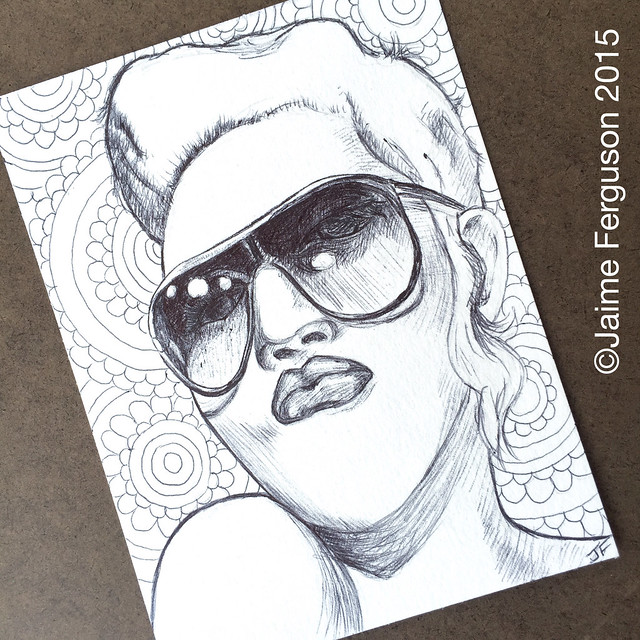
WIP Ballpoint of Gwen Stefani

I was not happy with the inked version of Gwen at all! This was another point where I had put her aside intending to never use her again. The original screenshot I had taken was pretty blurry and I had difficulty with the angle of her face and the sunglasses. I could barely see her eyes, but drew in what I could. In retrospect, I wonder if it would have been better if I had never drawn the eyes in at all. Texting two of my best friends with the results, they kept pushing me to continue to work on it and they thought I was seeing it more critically than anyone else would.

WIP Beginning to Paint Gwen
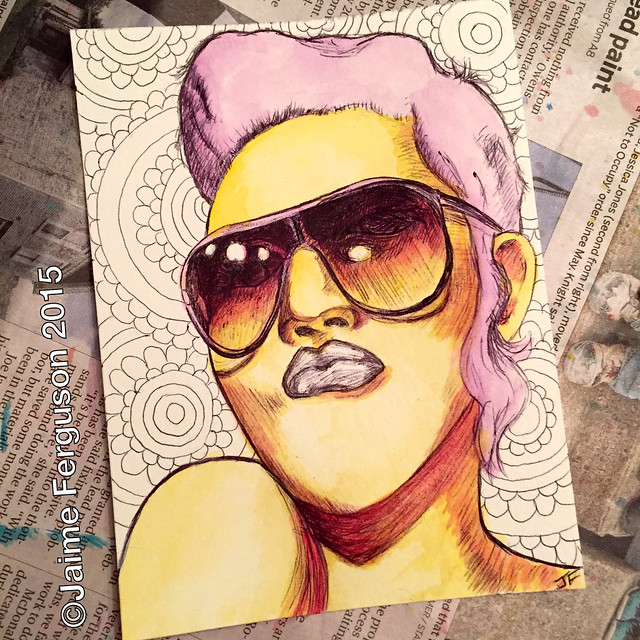
WIP: Beginning to Paint Gwen Stefani

Deciding to give her a go, I started painting some color into her and was beginning to LOVE how the sunglasses looked. I felt like her hair should be pink, but I do think the color decision made people think she was Pink even though Gwen did dye her hair pink for many years.

Final of Gwen Stefani
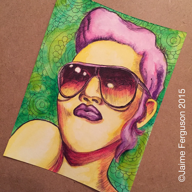
Final Mixed Media of Gwen Stefani

For being a work that I almost threw away, it turned out rather nice! There still could be improvements made, but there are times when I need to keep Salvador Dali in mind,

“Have no fear of perfection, you’ll never reach it.”

WIP Inked Version of Pink
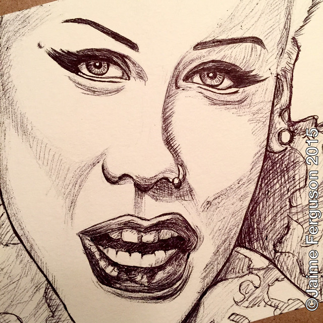
WIP Ballpoint of Pink

Once I had a chance to ink this one, I felt it looked better than the pencil sketch. I allowed the pencil sketch to sit for a while before I went ahead and inked it. The angle of her head and sneer Pink was making made it seem so out of proportion. I also wasn’t sure I liked her thick fake eyelashes in the drawing, but once she was inked it seemed to ground her on the paper for me.

Final of Pink
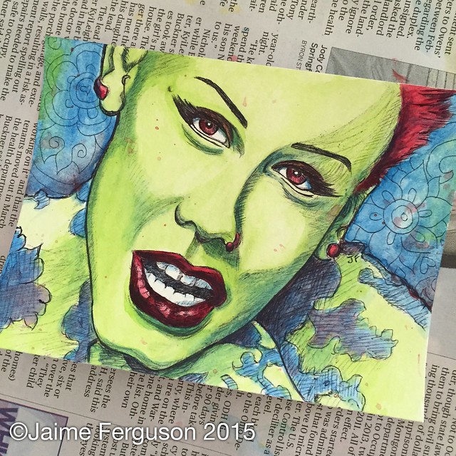
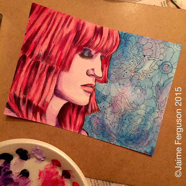
Final Mixed Media of Pink

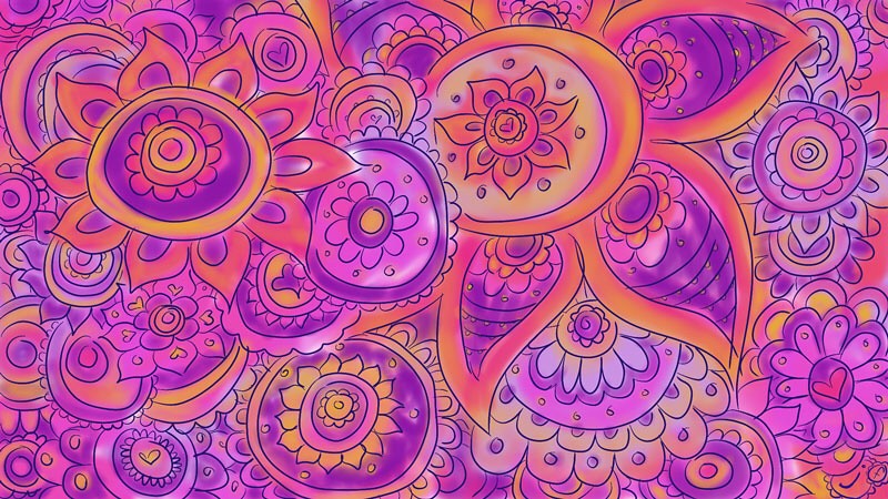
She was one of the few pieces I knew exactly what colors I wanted to use, and I had a blast with her. Since she didn’t have a lot of her hair showing, I balanced the composition by using the red in her earrings, eyes, and lips. I even mixed some of the red into the background and her outfit. It is something I try to do in a lot of my work. A lot of different colors can make up an object. Such as painting a blue sky on a landscape, maybe you can use that blue in the grass as a shading color. Trying to add the colors you use throughout your painting, drawing, etc can make it very cohesive.

Despite the struggles these three made me go through, I believe they added a little “oomph” to the series as a whole. It’s easy to work in a vacuum and convince yourself that your work isn’t good. So don’t be shy and show your piece(s) to someone you trust to get honest feedback from. You never know what you may have missed or what could be on it’s way to greatness.

“Even a mistake may turn out to be the one thing necessary to a worthwhile achievement.”

~ Henry Ford ~

Musician/Singer Series Pt. 2: Lajon Witherspoon & Florence Welch

Lajon Witherspoon Pencil Sketch

WIP pencil drawing of Lajon Witherspoon on watercolor paper

This pencil drawing from my Musician/Singer Series depicts Lajon Witherspoon, who is the vocalist for the alternative metal group Sevendust. The screaming in some metal bands can make my toes curl, but Lajon’s smooth and deep vocals are haunting to me. Plus, it helps that they have a strong melody in their music, and it isn’t just hardcore two note riffing the whole time. Lajon’s vocal range makes their music even more powerful to me.

WIP Inked Lajon Witherspoon

WIP inked version of Lajon Witherspoon

If you haven’t read my previous entry introducing the Musician/Singer Series, I had gone through various music videos from each band or artist to grab screenshots that I could use for reference. As a side note, I began to notice that music videos where the bands were all male seemed to have dramatic lighting creating high contrast and switched sometimes between B&W to color. Meanwhile, all of the women musicians were definitely more sexed up. The Pop and R&B genres had bright colors and less clothing. It’s sad that so many of our women musicians are encouraged to flaunt what they have, but most of the men never do. Not to say it never happens, but I found it an interesting observation while I was working on this project.

Final of Lajon Witherspoon

“Life is changing. I can’t go on without you. Rearranging. I will be strong. I’ll stand by you.”
-“Angel’s Son” by Sevendust

In the painting stage of each drawing in my series, I wanted to keep the colors unexpected for the viewer. I love painting in tones that are not the typical skin color. I chose colors by the feeling I had for each image. It’s hard to explain, but some of them just screamed at me what colors should be within the piece. Since I knew it was going to be a series, I did try to stick within about 5-6 different colors and usually painted with only 3 of the 5-6 colors in each piece.

The acrylic I like to use is by Liquitex. Their Professional Acrylic Artist Color Heavy Body in tubes has strong color and can go on thick or thin depending on how much water you have in your brush. They can be pretty expensive, but they do last a long time if you do not paint in very thick layers. Grumbacher’s Academy Acrylics are also another type of paint that I enjoy using. They are not heavy body like the Liquitex and will be more transparent when you paint with them (plus they are cheaper). I like to use the Academy Acrylics like Dioxazine Purple painted over top of a Liquitex Cobalt Blue to get a darker shade. Some artist’s may use the tube of black intentionally for shading or to make dark colors, but I do find it flattens the work. When you see someone with black hair, it can have a blue or purple cast depending on the lighting. It’s difficult to get that if you use straight up black, and that is why I will use other colors to create “black”. Also, I tend to not mix my colors on my palette ahead of time. I allow them to mix on the paper.

Final of Florence Welch

“And when we first came here, we were cold and we were clear.
With no colors in our skin, ‘Til we let the spectrum in”
-“Spectrum” by Florence and the Machine

Another piece from the series is of Florence Welch, who is the singer from the English indie rock band Florence and the Machine. I am not that familiar with the band and have only heard some of their music. Her voice was what caught my attention, and I couldn’t resist not including her in my series.